Logos designs build a memorable identity for your business or brand . A good Logo design will attract potential consumers and help you boost your sales and a Bad logo would just break it down . Which is why it is always advisable to go for a professional logo designer instead of hiring an amateur logo designer who will do your logo for just $5 . You may ask what’s the difference between a professional graphic designer and an amateur . They all create just logos right ?
There is an reason why Big brands pay a lump sum amount to create their logos . A logo can make your brand famous or even make it infamous .
Here are 10 bad amateur logo designs that went awkwardly wrong and made a fool of their client,s business and brands . You definitely need to see all these bad logo designs to get an idea why you should hire a professional logo designer .
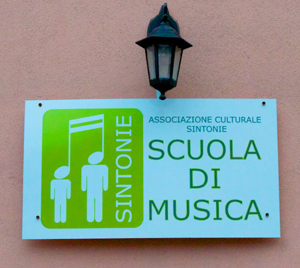
- SCUOLA DI MUSICA : The English translation for this term means ” School of music ” , There isn’t any way somebody is going to join their school , most probably their logo deign would scare everyone away .
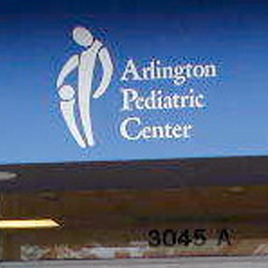
- Arlington Pediatric Center : Don’t ever hurry up with your logo design or you are going up to end up with something like this .
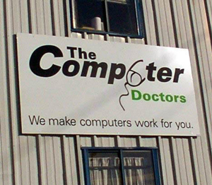
- The Computer Doctors : These doctors are going to have a bad time getting any patients .
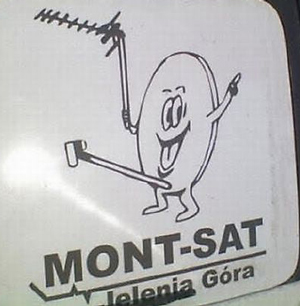
- MONT-SAT : this logo looks sure funny but its awkward at the same time .
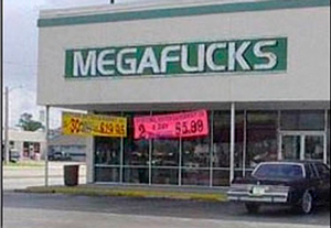
- MEGAFLICKS : A simple mistake in the placement of this logo and what an drastic error , a laughing matter for everyone passing by .
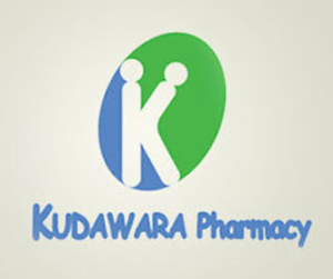
- KUDAWARA Pharmacy :
- Kids Exchange : All this logo is missing is a space between the letters , but again kids exchange ? a very bad barnd name for sur .

- Instituto de Estudos Orientais : Everything that looks good is actually not !

- Doughboys : No wonder why their pizzas’s are not selling too well , these guys surely need a logo makeover Asap !

- Comprehensive Health Care : Another logo to lol at !

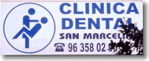
- Clinica Dental :
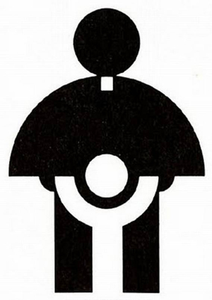
- Catholic Church Youth Association : This was an actual logo designed in 1973 for the Catholic Church Association youth commission . It seems the 70’s people were very innocent , we wonder how did anyone not notice this ?
- Bureau of Health Promotion : Oh yeah there promoting health awareness . we cant expect his kind of logos from an Government authority .

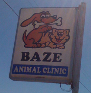
- BAZE Animal Clinic :
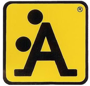
- We don’t know what this logo means , but surely this doesn’t look good .

We are sure this is how you don’t want your logos to end with . these funny logo design mistakes are big reason why you should go for a professional logo services instead of amateurs logo designers .
The chinese character on no. 15 means ‘multiple function toilet’ so it seems it is really much functions!